You can't fix what you can't see
Every athlete has imbalances. Most of them build slowly and invisibly over months of biased programming. By the time they show up as pain, the pattern has been there for a long time.
ZON's muscle map makes imbalances visible before they become problems.
The muscle map
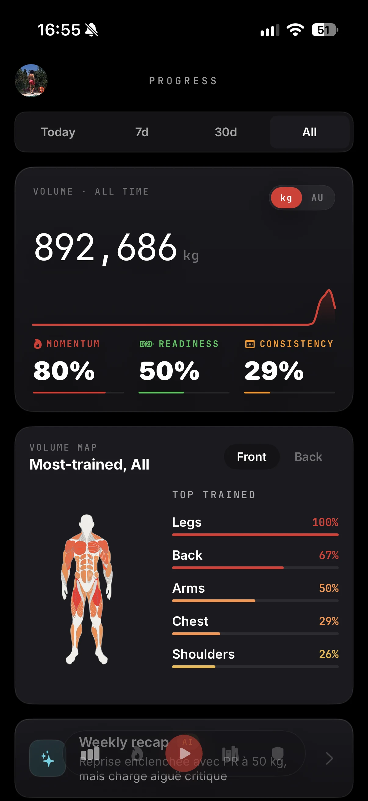
ZON keeps an anatomical model of your body overlaid with your training data. Every muscle group is colored by how much work it received over the selected period: today, 7 days, 30 days or all time.
Muscles you've been hammering show hot. Muscles you haven't touched go cold. Flip between the front and the back to check both chains, and read the ranked list of your most trained groups next to the map.
No manual tagging: every logged set feeds the map automatically, based on the muscles each exercise targets.
Progression charts per exercise
Pick any exercise and ZON shows your full strength curve on a chart you can touch:
- Every logged session plotted over time
- Best set per session highlighted
- A trend line showing your direction
- Touch any point to see the exact date, weight and reps
This is how you answer the question "am I actually getting stronger on this movement?" Not with a feeling. With a curve.
Part of your stats
The muscle map sits in your stats alongside heatmaps, your PR hall and your training trends, so balance, volume and progress read as one picture. With ZON Pro, predictive analytics add a projection of your next max.
In the ZON app on iPhone. Android is in beta: join the waitlist at justzon.com/android-waitlist.